Are you still using Excel or have you already switched to Power BI? – Part 2
This is the second article in our blog series on the topic of data analysis and KPIs from the areas of marketing, sales, service and commerce using Microsoft Power BI. The data source SAP will also be an important part of this. Join us on a journey through the Power BI cosmos from first insights into existing tools to a more intensive look at use cases.

Do you remember Tony Stark and Pepper Potts – the characters from our first blog post?
Pepper Potts, now Head of Business Intelligence at Workforce Machinery, leads a team of data engineers, analysts and project managers. The team is not only responsible for managing and analyzing the volumes of data that are generated daily inside and outside the company, but is also essentially responsible for ensuring that a data culture prevails within the company and among employees. When it comes to sharing reports and key figures, working with Excel is very tedious. Endless mails with attachments, data that is often no longer comprehensible and an inconsistent database, which often makes cooperation between departments, data analysts (controllers) and managers difficult.
But also the reporting and the presentation of key figures is very static with Excel. In the weekly management meeting, the managers, for example the sales area manager, have to explain the key figures that were determined by the data analyst in case of large deviations. Using screenshots from Excel, elaborate PowerPoint slides are created and explained to management. When asked how the key figure was last year, the person in charge usually cannot answer ad hoc. Therefore, the Excel spreadsheets from last year have to be searched out first, the figures have to be processed and possibly only shown in the next management meeting.
Power BI – better processes and a User Xperience that inspires!
With Microsoft Power BI, the preparation of figures, as well as the sharing of results, is automated and dynamic. Once a report has been set up by Pepper Potts, for example, the person responsible is able to view daily updated data and to intervene quickly in the event of unexpected deviations and to base decisions on data. Sharing of reports is done through the Power BI service, which also allows comments to be made and people to be tagged. Pepper Potts, who queries data from a database, transforms it in Power Query mode. She looks at only the most important KPIs on a daily basis and comments on any anomalies.
The report is not only available in the Power BI service. Pepper Potts has also pinned the analysis in the Microsoft Teams Channel, so she doesn’t always have to leave her usual work environment. With the PowerPoint add-in, the sales area manager is able to integrate the report into his presentation and can flexibly set new filters in response to queries from management and answer the queries accordingly.
BI Glossar
In the first part of this blog series, you were shown the basics of Power BI. In this part, we will introduce other essential components of Power BI.
Power Query
One of the most important components of Power BI is the Power Query module. This provides a graphical interface for retrieving data from sources and an editor that makes it child’s play to transform and cleanse data. You can use Power Query to perform classic ETL (Extract, Transform and Load). This functionality exists not only in Power BI, but the Power Query component is also available in Excel. With Power Query you can retrieve different databases, web sources but also files or whole folders where the files are stored and perform classic transformation steps or data cleansing like the changes of data formats and naming as well as the deletion/merging/separation of single columns.
Three views in Power BI Desktop
Power BI Desktop is the tool for data analysts who are responsible for building new analyses and reports.
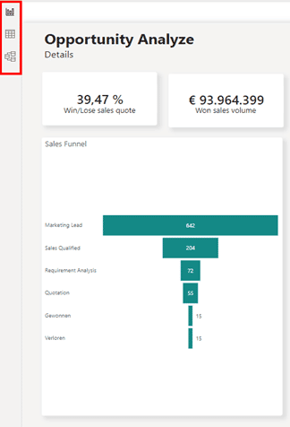
In Power BI Desktop there are three views that can be selected on the left side.

With Microsoft Power BI, you not only have the ability to analyze your data to make fact-based decisions, but you are also able to make your processes more efficient.
Sounds exciting?
We, the itmX Business Intelligence Team, see ourselves as process experts mainly in the areas of marketing (analytics), sales (analytics), service (analytics) and commerce (analytics) with a strong technological understanding in the worlds of Microsoft and SAP. SAP ECC, S/4HANA or SAP BW is the starting point for most of our customers, as this is where all relevant company data is usually located.
If you need more information about Microsoft Power BI, data integration with SAP, marketing tools such as Google Analytics or process optimization along your customer journey, please contact me.
We will be happy to help you.
About the author

